Black & Blue
Brand Identity
|
Exhibition Branding
|
2021
|
Brand Identity | Exhibition Branding | 2021 |
The brief
“You must create a unique name for your exhibition identity and you will develop your brand through the design and implementation of a graphic system. This will form the basis for your design choices across a number of deliverables based on the theme of ‘uniform’.
This graphic system will dictate the visual language and it should stay consistent across your outcomes. This means that typographic systems and families, colour, grids, imagery, dimensions and materials should be considered and central to your outcomes.
It is indicative that the design is sympathetic to the chosen subject matter and appropriate to your target audience. The space must be chosen by you and can be an existing gallery space or an alternative space.”
The objective
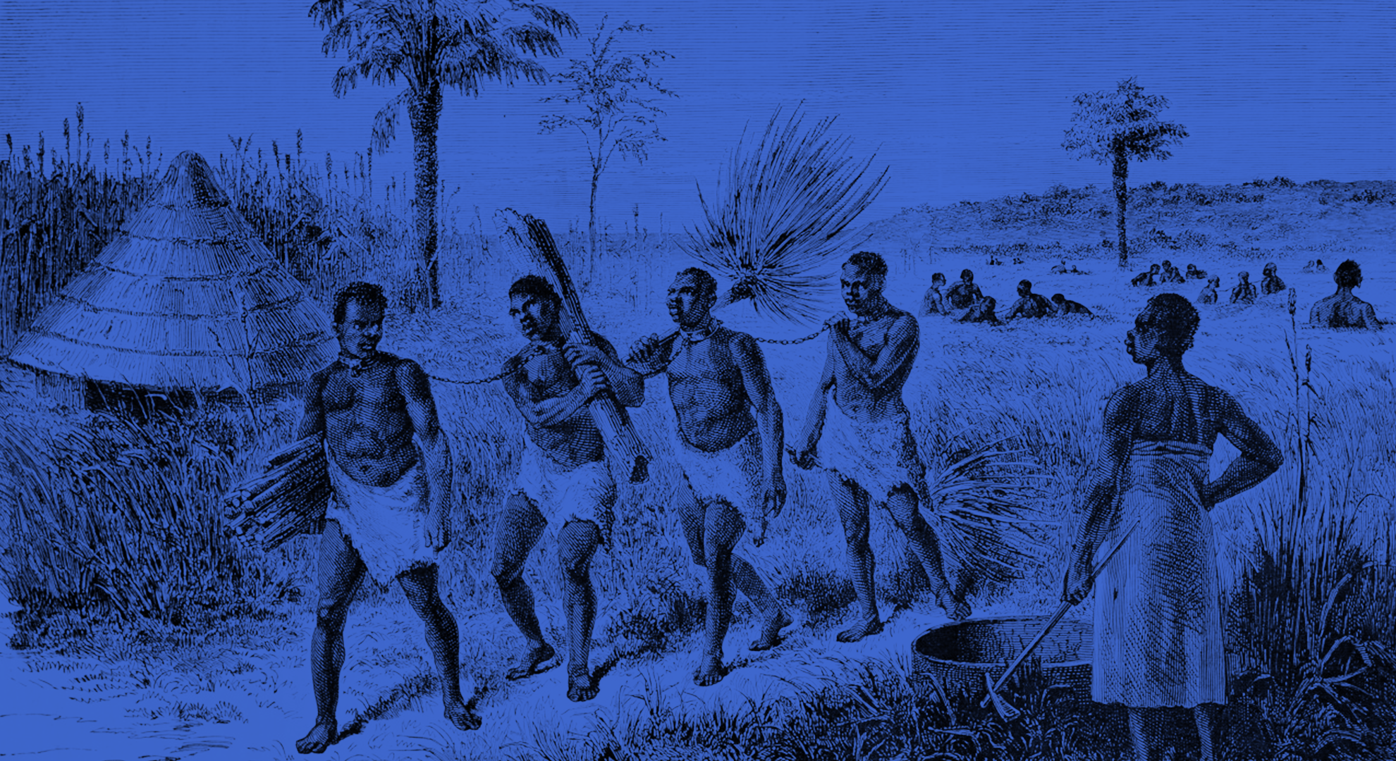
With police brutality still a major issue, this exhibition is designed to give Black people a space to speak, share lived experiences, and shed light on the injustices African Americans face every day.
The branding is intentionally bold and emotionally driven. It aims to provoke thought, spark empathy, and invite people of all backgrounds to engage, reflect, and want to learn more.
Overarching ideas, influence and concept
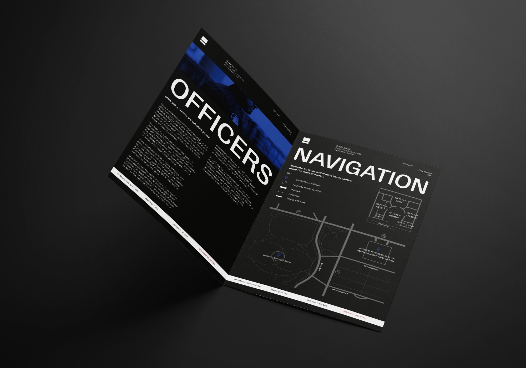
Inspired by the Black Lives Matter movement, this project explores what society continues to overlook: Black voices, perspectives, history, and the complex role of Black officers. These are the things that matter, and the branding aims to bring them forward.
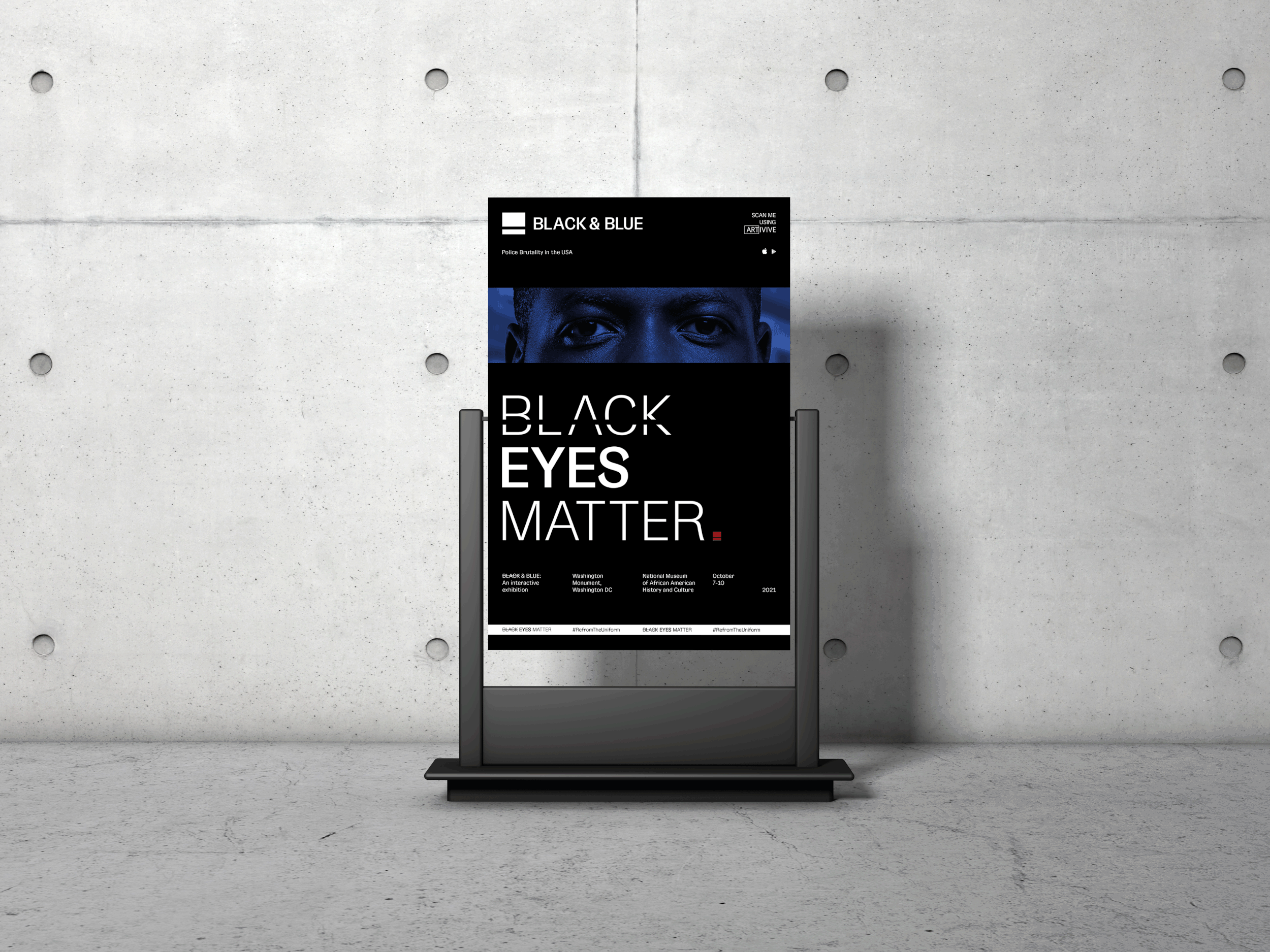
The idea began with perspective, aiming to spark conversation around police brutality through Black eyes. Eyes became the visual anchor, chosen for their emotional weight and psychological impact. From there, the concept expanded to include "voice" through music which is a powerful form of expression deeply rooted in Black culture.
The logotype and name are tied to a key statistic. Black people are 2.5 times more likely to be fatally shot by police than white people (Statista). This fact is built into the branding in a subtle but deliberate way. It supports the message without overpowering the emotional tone.
The identity was designed for both physical and digital spaces. Social moments like #BlackOutTuesday, which reached over 22 million posts, influenced how the brand needed to exist, in an honest, human, and a digital way.

Logo & Naming
The logo is a visual response to inequality. It takes the form of an "unequal" equals sign, with the top bar 2.5 times taller than the bottom, a direct reference to the statistic that Black people are 2.5 times more likely to be fatally shot by police than white people.
The name plays on the phrase "beaten Black and blue", highlighting the violence Black communities face at the hands of law enforcement. It also references both skin tone and the colour of police uniforms, reinforcing the message through layered meaning.


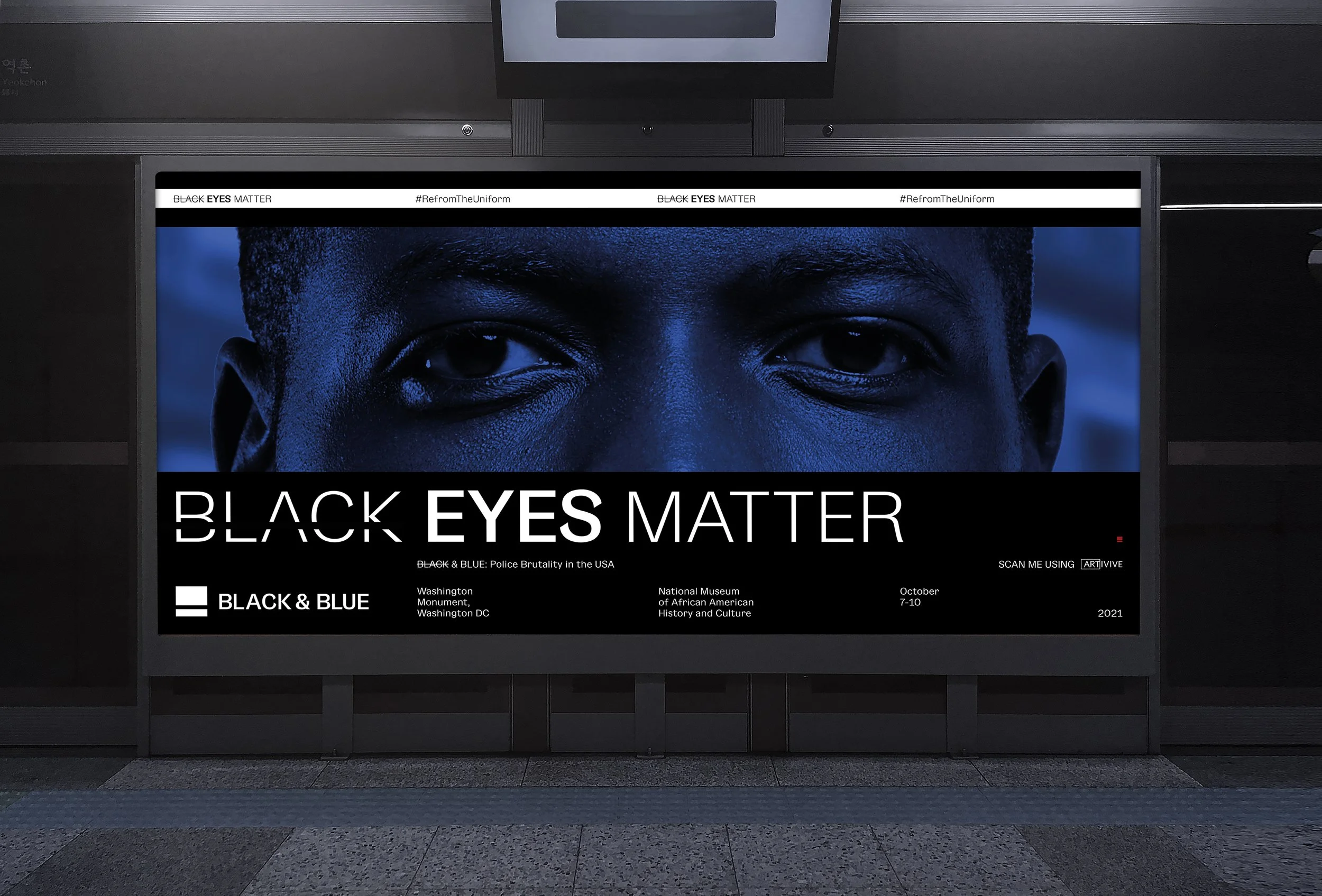
The posters
The posters work as standalone printed pieces, but they also include an augmented reality (AR) layer. AR adds a digital dimension to print, offering an alternative perspective. In this context, it reinforces the message that understanding requires more than a singular point of view.

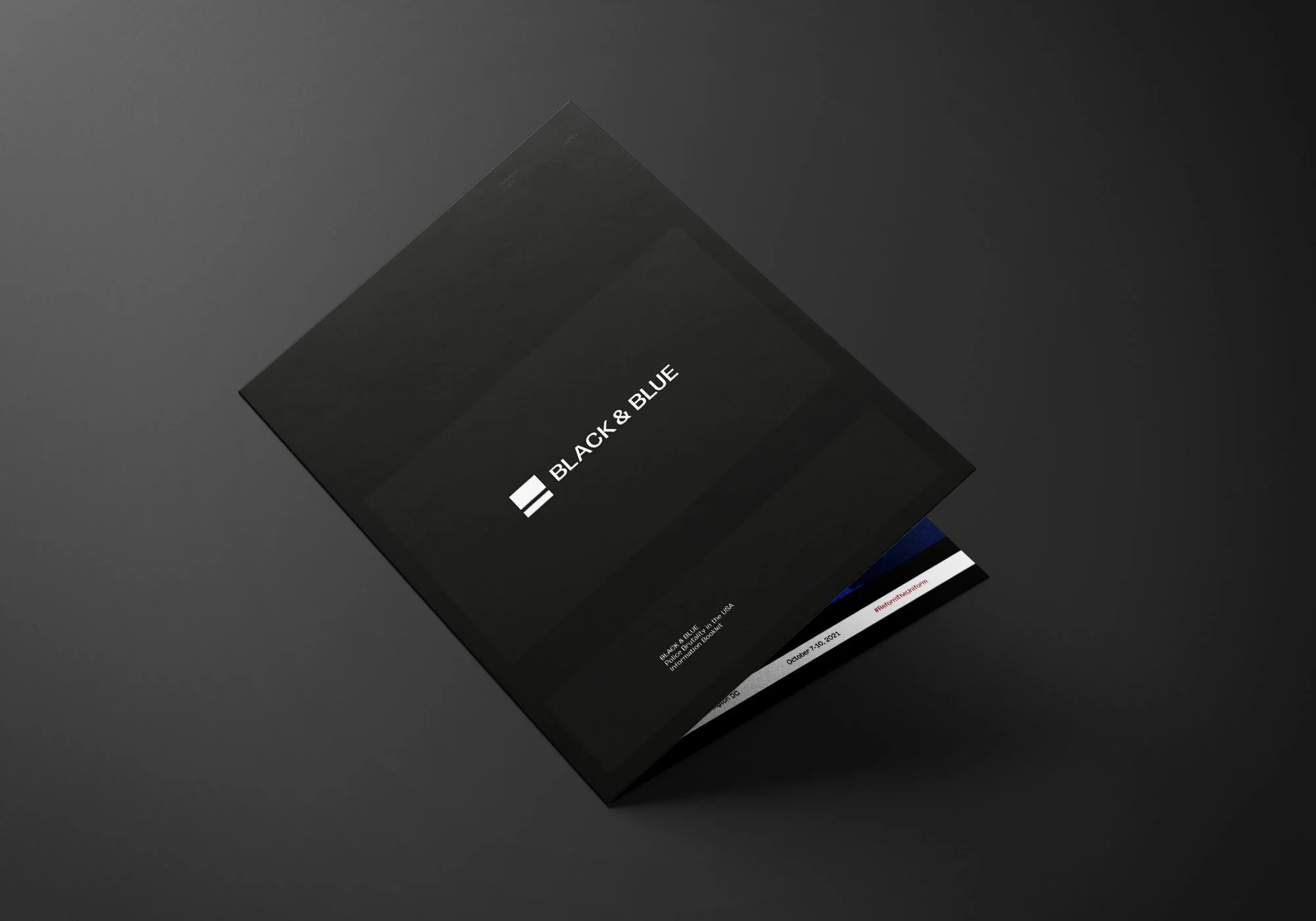
The booklet
The booklet would be given to visitors of the exhibition upon arrival, outlining in further detail more information about each section, as well as provide a designed map of the space and surrounding area.
Out of home
The billboards serves as spatial communication outside of the exhibition space and posters. It also acts as another example of digital presence, either through digital billboards or the use of AR to deliver extra content.
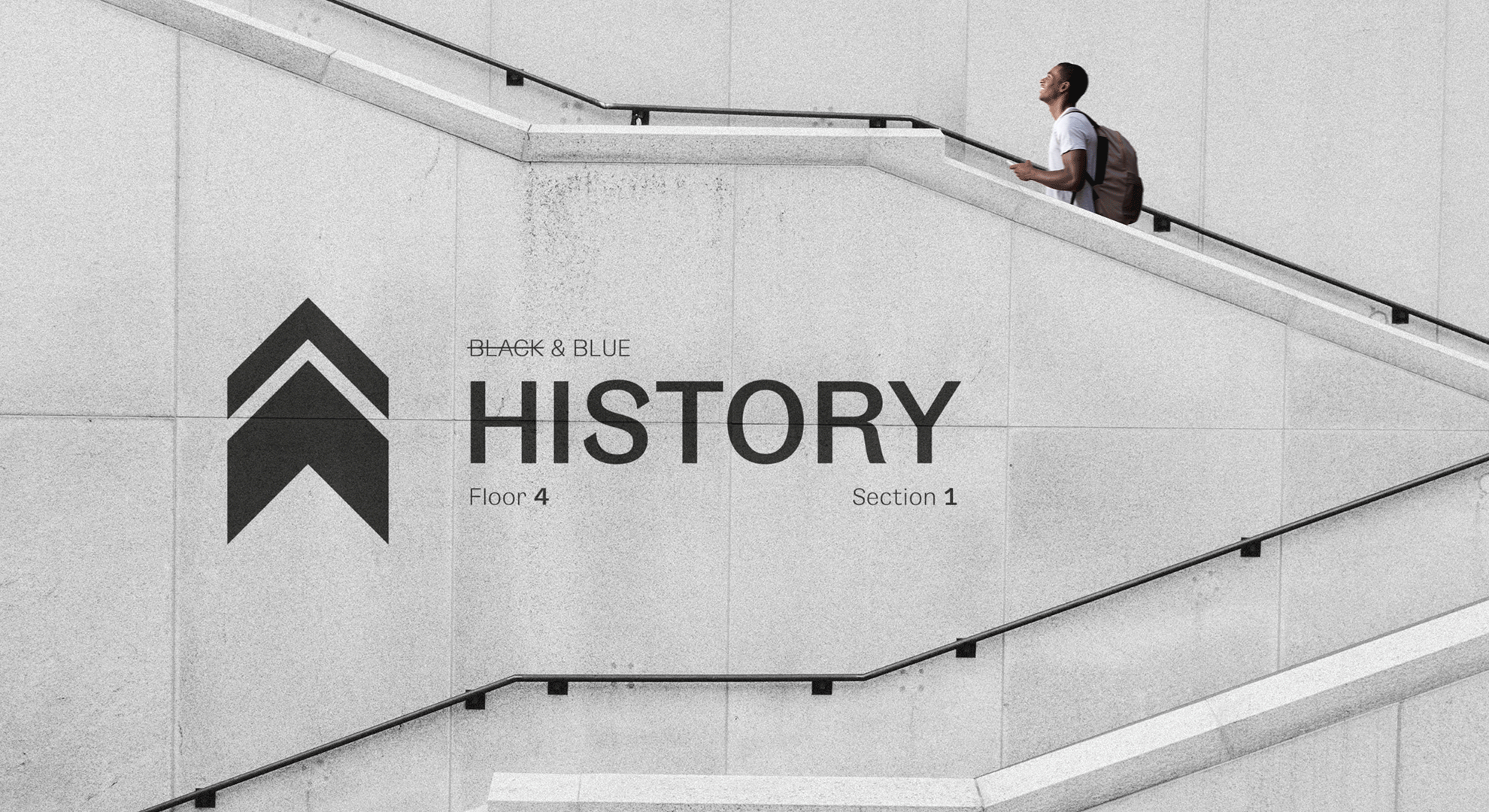
Wayfinding
Using the same proportions as the logo to keep brand consistency, the wayfinding assists the visitors to navigate the exhibition outside of the map given in the booklet.
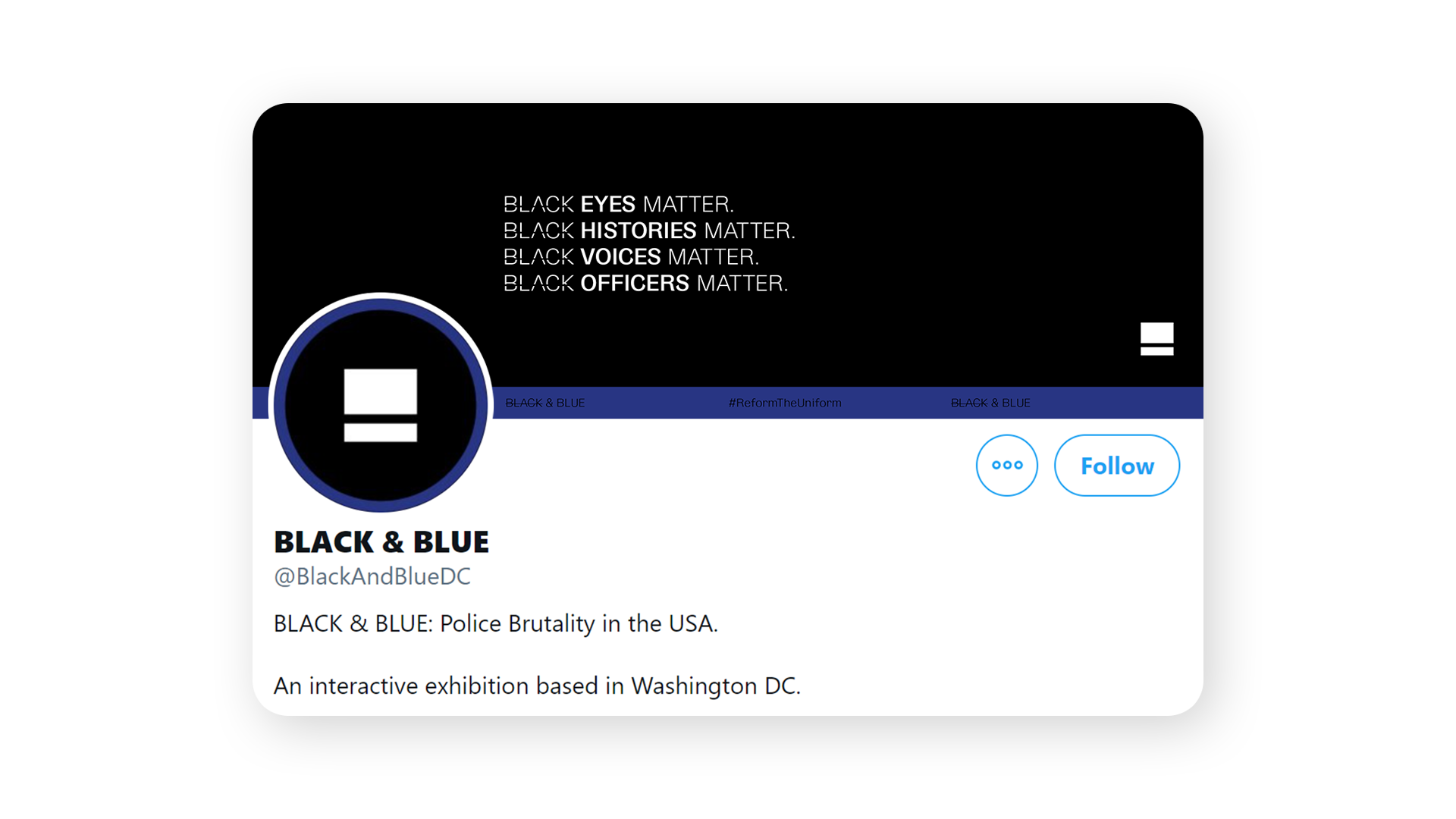
Social profile
Here is an example of the branding across social media platforms. I’ve opted for a typographic banner with the messaging from the posters at the forefront to cover the full scope of the content within the project.
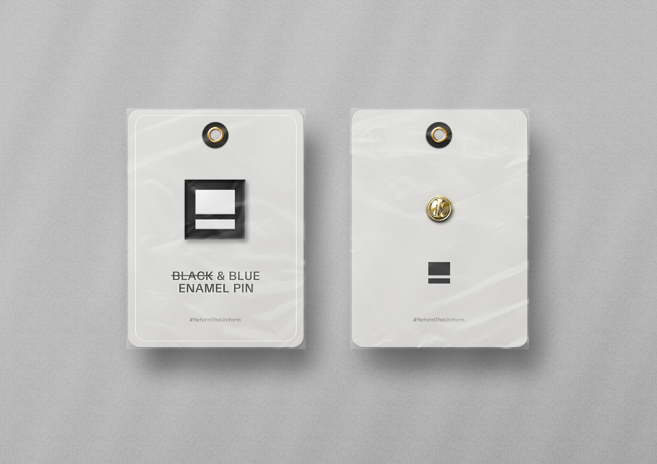
Lapel pin
Lapel pins are common and important within American culture. Politicians are known to wear an American flag lapel pin as a symbol of patriotism and pride.
By using a BLACK & BLUE pin, it can be seen as sign of rebellion in and of itself, showing pride in being black, against the very people who are oppressing them.
Like what you see?
From messy thoughts to meaningful designs, let’s decode your next project together.